# Global Energy Statistics
A number of international organizations track and provide data for energy production and consumption on a global and national level. In this tutorial we will:
- explore some "ready-made" options, and
- learn to prepare your own sunburst visualization from a raw data source
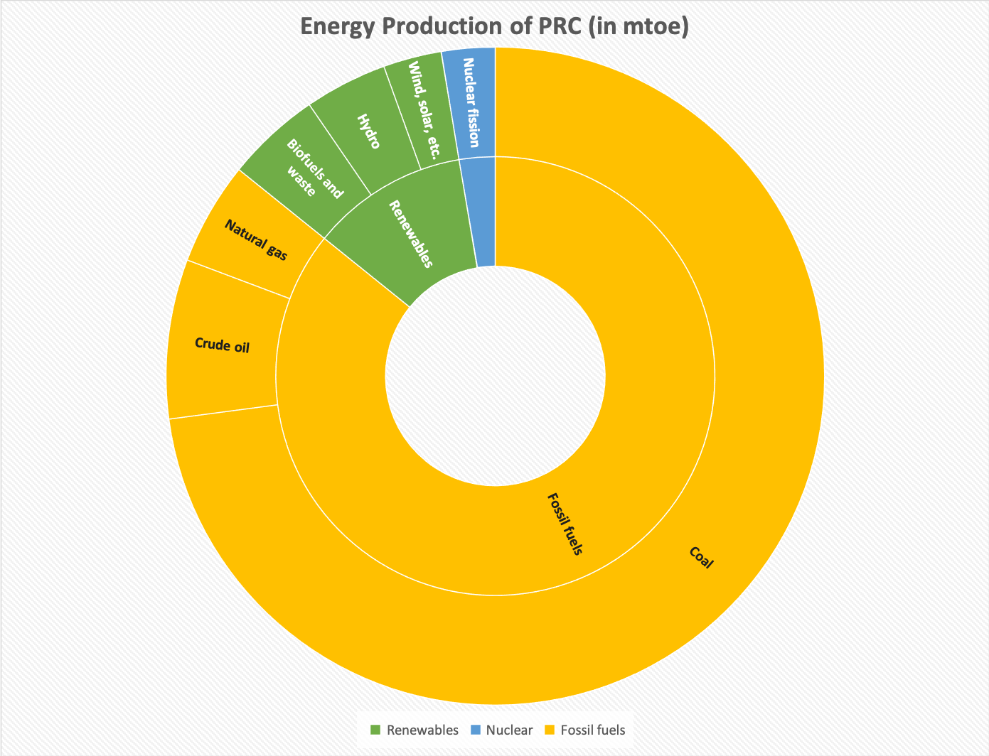
A sunburst diagram is a way to visualize a hierarchy of quantitative information, a multi-layer pie chart that shows not only the distribution of Fossil Fuels vs Nuclear vs Renewable, but also the detailed spread within. An example of the kind of diagram you will construct is shown here.
# Preparations
We will need both Google Sheets and Excel in this tutorial. Google Sheets is used to clean up the raw data, and Excel used to build the sunburst diagram.
Workflow
Under the Excel brand there are many versions with different features. Excel Online, Excel for Mac, Excel 2019/2017/2013 (for Windows) have different capacities, and notably there is no easy way to unpivot in anything other than Excel 2017+ for PC. For this reason we will use Sheets for the data cleaning.
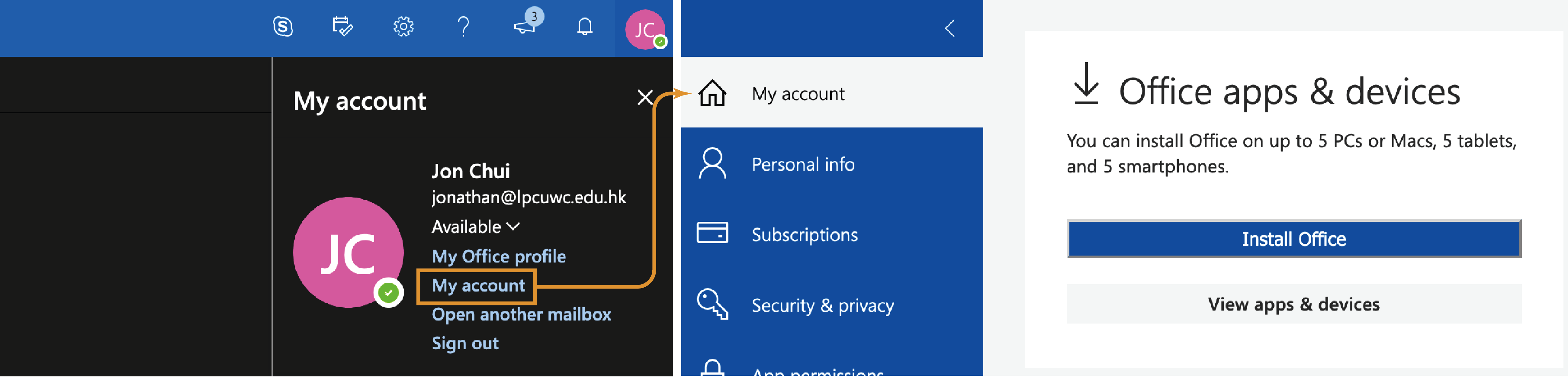
The College paid for your copy of Excel subscription! If you have not installed Excel on your computer, you can download it by going to My Account in your Outlook Mail interface.
# Interactive Visualizations
# IEA
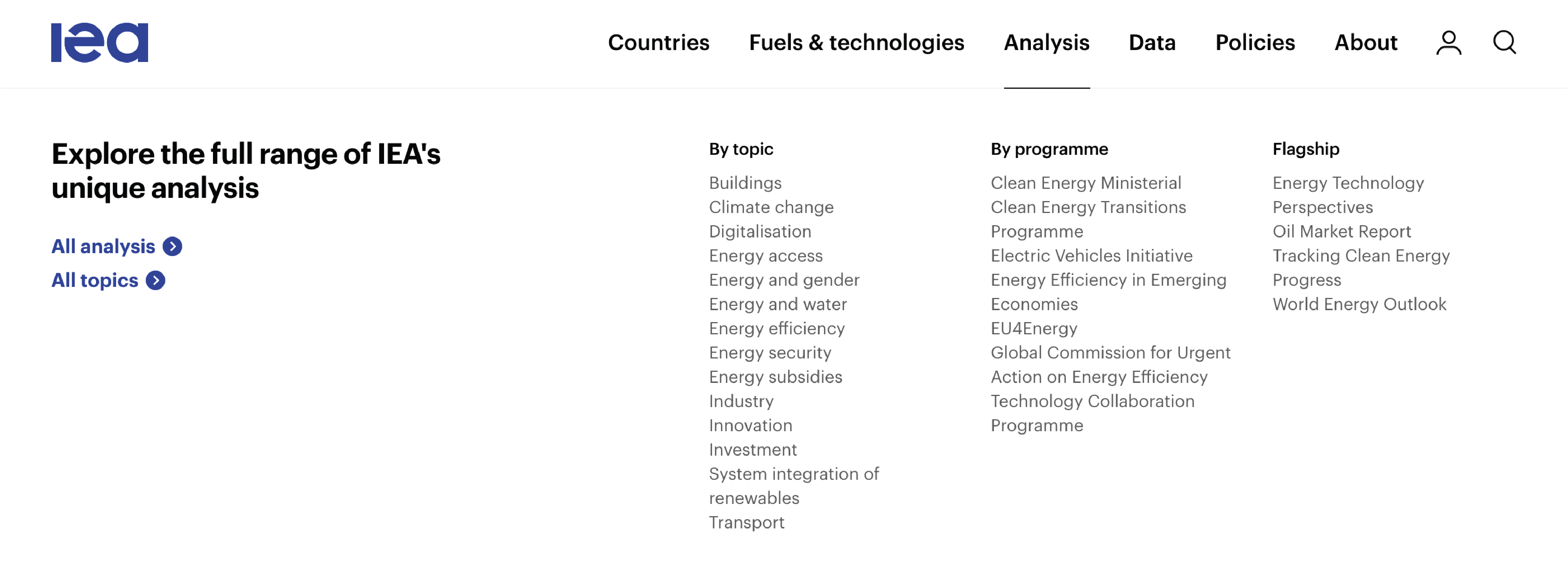
The International Energy Agency (IEA) is a leading organization for energy statistics. You can read their analyses on their website, which covers both geographical regions as well as different sectors.
IEA also provides interactive graphs for visualizing common trends. For example, "coal" is actually an umbrella term, and you can see its distribution growth and changes from a graph like this:
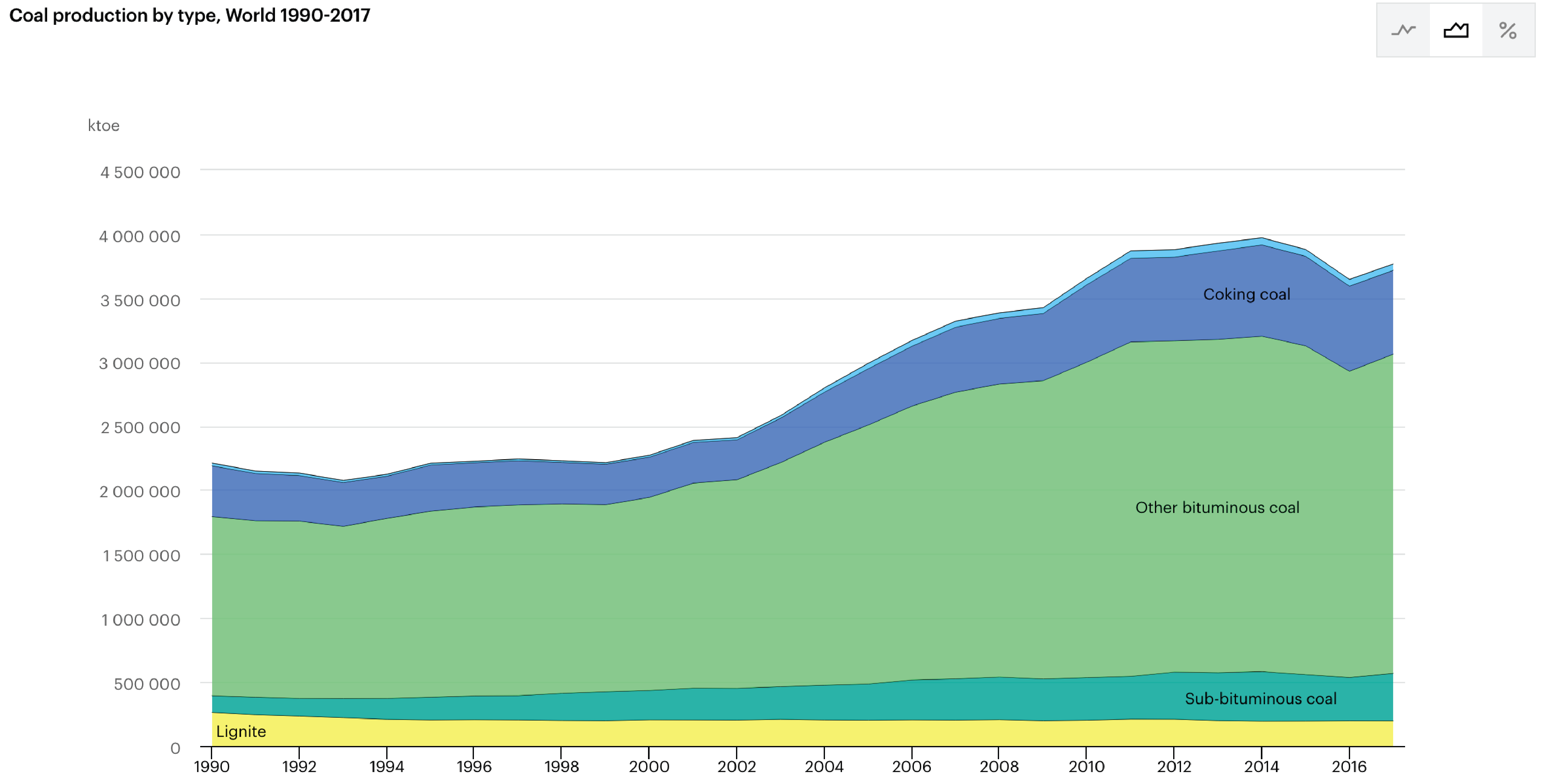
...which can be accessed from here.
Task 1: CO2 Emissions by Sector
Generate a graph of CO2 emission by sector for your country.
We will come back to the IEA to extract their raw data for a bespoke analysis.
# UN Stats
The United Nations (UN) Department of Economic and Social Affairs have a Statistics Division, that collects and provides annual statistics on production, trade, and consumption of energy.
What is interesting is the Excel spreadsheets they have built, which have a live connection to their online sources, and allow you to do explorations on your own desktop. You can find these dashboards (interactive spreadsheets providing data overview) here.
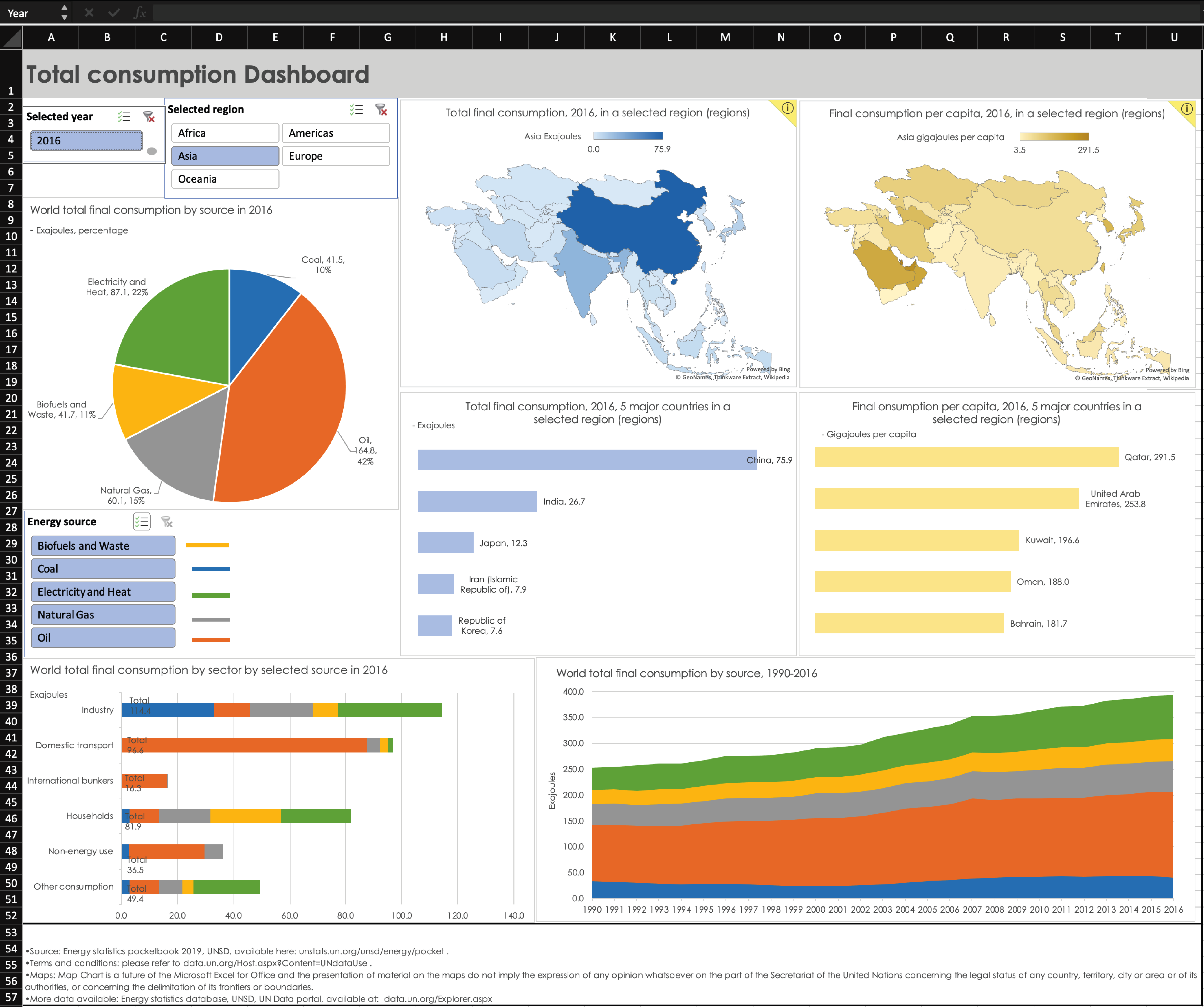
Task 2: Energy Production by Region
Generate a graph of energy production (in 2016) for your region (e.g., Asia for me, Africa for Alfred).
# Crafting your own visualization
While there are lots of visualzation that has been prepared, maybe exactly the one you need is not available. It is useful to be able to generate graphs according to your design.
As an example, from UN Stats you were able to visualize the regional energy production; but the national data is not available.
Furthermore, we know that coal, oil, and natural gas are all examples of fossil fuels, which are formed geologically over millions of years and are not renewable. How do we at once see the spread of renewable vs non-renewable energy (as categories) and the detailed spread? We could use a sunburst diagram as hinted before:
...but how do you make one?
# Overview
Most data visualization tasks involves a 3-step process:
- Acquire data
- Clean / transform data
- Visualize
We will acquire the data from IEA, clean/transform data using Google Sheets, and visualize it in Excel. See the tutorial video here:
Task 3: Energy production sunburst diagram for your country
Generate a graph of energy production (for the latest year of which data is available) for your country.